aritra-dataviz-portfolio
| home page | data viz examples | critique by design | final project I | final project II | final project III |
Love Can Wait: How Women’s First Marriage Age Has Increased from 2006 to 2019❤️👰🏻♀️
Redesigning Data Visualization: Median Age at First Marriage for Women
Step One: The Visualization📊
Original Visualization
Original Chart Link - Original Chart
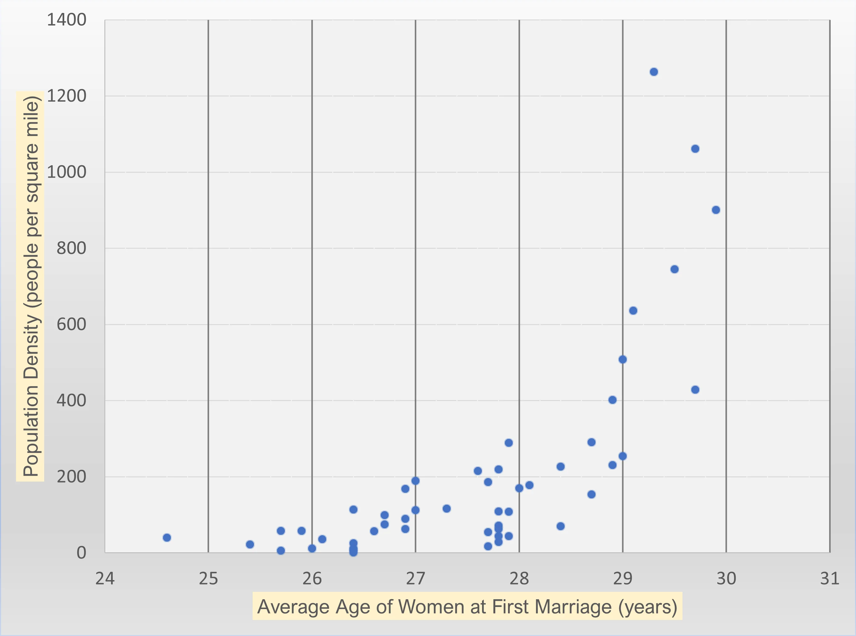
The original visualization was a scatter plot showing the relationship between median age at first marriage and population density per square mile across U.S. states. I selected this visualization because it aimed to uncover a potential correlation between urbanization and marriage trends, which is a valuable insight for policymakers, researchers, and sociologists. However, the scatter plot had several weaknesses that needed improvement.
I chose this visualization because while it attempted to explore an interesting correlation, it failed to clearly convey how marriage age trends evolved over time. While a scatter plot is an appropriate choice for displaying relationships between continuous variables, it does not effectively communicate changes over time, making it difficult to track historical shifts. Additionally, it lacked geographical context, which is crucial for understanding regional differences in marriage age trends. The visualization did not effectively highlight state-specific insights, making it challenging to compare trends across states like New York, California, and Massachusetts, which saw significant increases, versus Alabama and Arkansas, which had smaller shifts.
By redesigning this visualization, I aimed to create a more intuitive and engaging representation that would allow viewers to easily compare how marriage age has increased across different states over time.
Step Two: The Critique🧑🏻🏫
Using Stephen Few’s Data Visualization Effectiveness Profile, I evaluated the original scatter plot and identified several strengths and weaknesses:
Effectiveness Scale Ratings
| Criteria | 1 | 2 | 3 | 4 | 5 | 6 | 7 | 8 | 9 | 10 |
|---|---|---|---|---|---|---|---|---|---|---|
| Usefulness | ✅ | |||||||||
| Completeness | ✅ | |||||||||
| Perceptibility | ✅ | |||||||||
| Truthfulness | ✅ | |||||||||
| Intuitiveness | ✅ | |||||||||
| Aesthetics | ✅ | |||||||||
| Engagement | ✅ |
Key Takeaways from the Critique
✅ What Worked Well:
- Appropriate Visualization Type – A scatter plot is suitable for showing relationships between continuous variables.
- Truthfulness – Data was accurately represented without manipulation.
- Adequate Axis Labeling – Both axes clearly defined the variables.
❌ What Didn’t Work Well:
- No Trend Line – Hard to interpret correlation without a guiding line.
- Poor Label Readability – Yellow background on axis labels made text difficult to read.
- Lack of Context – No geographic context (e.g., state-wise identification).
- No Call to Action – The graph didn’t explain why this data mattered.
- Missing Title – The audience had no immediate understanding of what the visualization was about.
Based on these insights, I planned to redesign the visualization to provide better clarity, engagement, and usability.
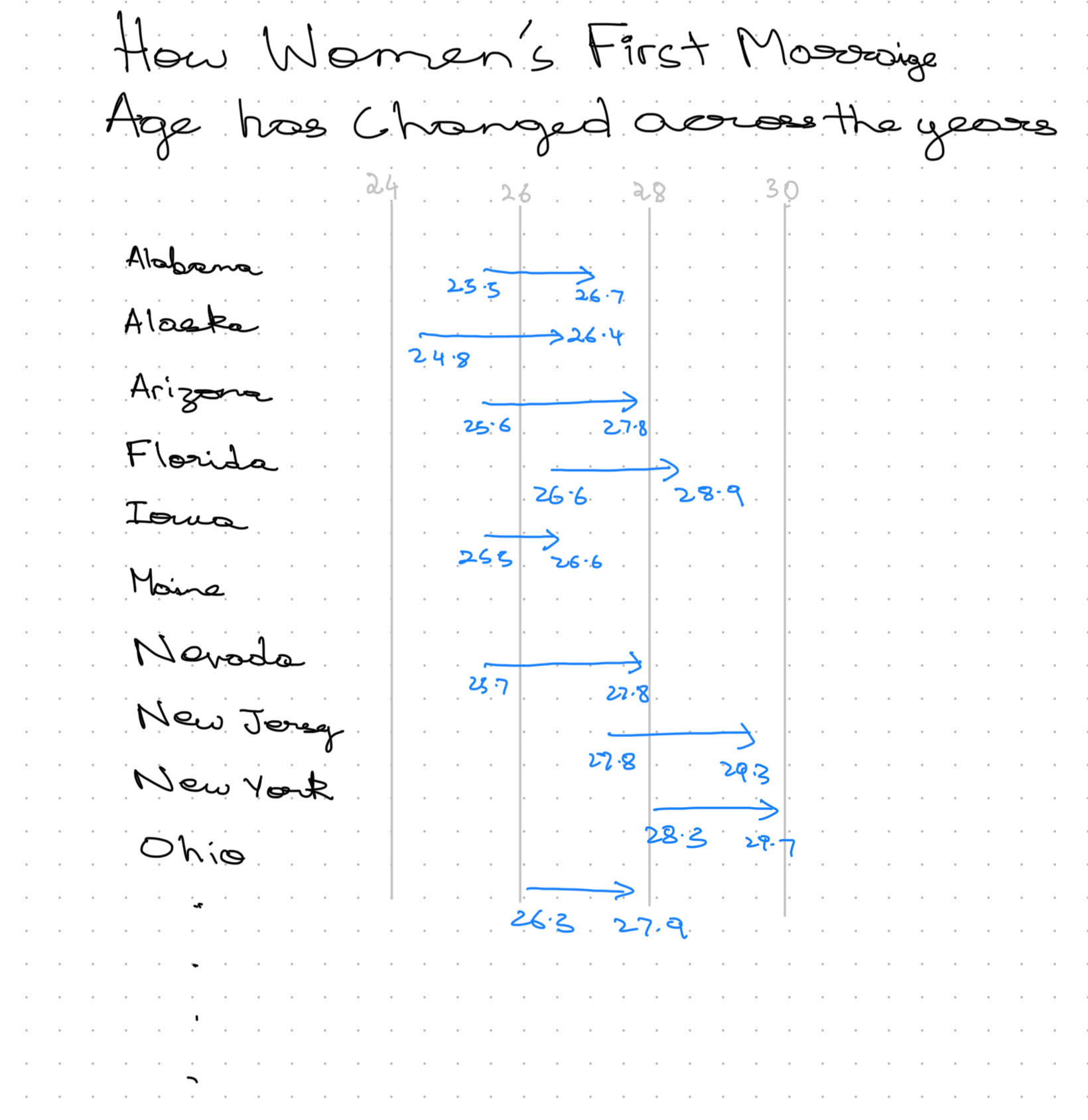
Step Three: Sketch a Solution✍🏻
Redesign Plan:
I created two types of sketches for the redesign:
- Choropleth Maps – Two separate maps displaying median ages across states, one for 2006–2010 and another for 2015–2019, to clearly show state-wise distribution.
- Arrow Plots – A visual representation of how the median age changed between the two time periods across states, using arrows to indicate the shift in values.
These two approaches allow for both geographical comparison and a clear visual representation of changes over time.
By using:
- Choropleth maps, viewers can easily compare regional differences in first marriage age for women across two different time periods.
- Arrow plots, they can quickly identify states where marriage age has increased or decreased, with the length and direction of arrows signifying the degree of change.
This redesign approach enhances both clarity and engagement, ensuring that policymakers, researchers, and the general public can grasp the key insights at a glance.
Sketch 1
.png)
.png)
Sketch 2
Step Four: Test the Solution🧪
User Feedback & Testing
I conducted three user interviews to gather feedback on the redesigned sketches. The goal was to assess if the new visualization was easier to understand and more engaging.
Interview Questions & Results
| Question | Interview 1 (Student, BIDA) | Interview 2 (Student, MSPPM) | Interview 3 (Student, MAM) |
|---|---|---|---|
| What does Sketch 1 tell you? | “Shows geographical differences in marriage age.” | “State-wise breakdown of first marriage ages.” | “Easy to see which states have younger or older averages.” |
| Is there anything you find confusing or unclear in Sketch 1? | “No immediate comparison between time periods.” | “Would be better if differences were highlighted more.” | “Some states have very similar colors, making differences harder to notice.” |
| What does Sketch 2 tell you? | “Shows how marriage age has changed over time for each state.” | “Clear comparison between time periods.” | “Gives a strong visual representation of increasing trends.” |
| Is there anything you find confusing or unclear in Sketch 2? | “Arrows make it look a little complex.” | “Might be hard to compare for states with smaller changes.” | “Spacing could be improved for readability.” |
| Out of the two sketches, which one do you prefer? | “Sketch 2 (Arrow Plot) – It better represents change over time.” | “Sketch 2 – Easier to understand the trend.” | “Sketch 1 – Prefer geographical context over numeric change.” |
| Is there anything you would change in either of the sketches? | “Add labels for states with significant changes.” | “Consider color coding regions or trends for clarity.” | “Remove arrows in Sketch 2 and use dots instead to make a range plot.” |
Synthesis of Feedback
- 2 out of 3 users preferred the Arrow Plot (Sketch 2) for effectively showing the change in marriage age over time.
- 1 user preferred the Choropleth Map (Sketch 1), finding it easier for geographical comparisons.
- All participants agreed that if the goal is to showcase differences in values, the Arrow Plot (or an alternative range-based design) is better.
- One user suggested removing arrows and instead using only dots to create a range plot, making it easier to interpret.
- Additional clarity needed in Sketch 1 – Some states had very close values, making differences harder to spot.
My Thoughts After the Interviews
I initially liked the map for visualization, but as pointed out by the interviews, it didn’t showcase the difference across time periods effectively. This got me thinking about the story I want to tell with this data. I decided to focus on how the median age for women’s first marriage increased over time and wanted to highlight that trend.
This led me to consider how to move from two separate maps to a single visualization, as having two maps made it harder for the reader to analyze and compare different states. Additionally, some states had similar values, leading to similar colors, which made it challenging to distinguish trends.
Given this, I decided to stick to the arrow plot, as it better conveyed the trend across states. I also took into account the feedback from one of the interview participants who suggested removing the arrows and instead using dots to create a range plot. This adjustment made the visualization clearer and easier to understand, aligning better with my goal of effectively showcasing the increase in marriage age over time.
This feedback led to the final decision of converting Sketch 2 into a range plot by replacing arrows with dots for a cleaner and more interpretable visualization while keeping Sketch 1 as a supplementary geographical reference.
Step Five: Build the Solution🏗️
Final Visualization:
Key Changes in the Final Design🔑
- Range Plot Instead of Scatter Plot – Transitioned from a scatter plot to a range plot, making it easier to visualize how the median age at first marriage has changed over time for each state.
- Single Chart Instead of Two Maps – Moved away from using two separate maps for each time period, consolidating the comparison into a single, easy-to-interpret visualization.
- Readable Labels & Improved Contrast – Removed unnecessary background colors, increased contrast, and refined the layout for better readability.
- Gray Bars for Visualizing Change – Added gray connecting bars to clearly show the shift in median age between 2006–2010 and 2015–2019.
- Annotated Key States & Contextual Notes – Highlighted significant trends and ensured key takeaways were visible for easier interpretation.
Final Thoughts on the Process🤔
This redesign process significantly improved the clarity and usability of the visualization. The Stephen Few critique method was helpful in evaluating the technical aspects, but user interviews highlighted the need for storytelling to make the data more engaging and intuitive. By switching to a range plot, the final design presents a clear, state-by-state comparison of how marriage age has increased, making insights more apparent and accessible for a broader audience.
References📚
- Data source: Data source
- Original visualization: Original Chart
- Viz Review Video: Video
- Few, S. (2017). Data Visualization Effectiveness Profile. Perceptual Edge.
AI Acknowledgements🤖
For this assignment, I used ChatGPT to help refine my ideas and brainstorm chart ideas for data across different time frames. Additionally, I utilized Grammarly to check the grammar of my writing as well as improve it.